Help Scout’s Brand Animation Process


Last month, Help Scout released our shiny, new Brand Handbook into the wild! The handbook is an important brand expression for Help Scout, both as a tactical tool kit for talking about our brand, and as a piece that expresses how the values we hold as a company come to life.
In the early stages of designing our Brand Handbook, Help Scout’s design team first turned our focus to how we could visually depict our brand values. It was important to us that these values could exist not just as a list of words, but as something that could be seen and experienced.
We began to think about how this would include our illustration style (see Bronwyn’s excellent post for a deep dive into this) as well as motion — brand animation.
This gave us an interesting question to explore:
What types of motion would feel like Help Scout?
Keeping our brand values — Helpful, Human, Trustworthy, Energetic, and Curious — in the front of our minds, we began the process of experimenting with different types of motion. This led to a process of trying many things with a bit of “you’ll know it when you see it” guiding the way.

Brand animation principles
Eventually we arrived at a loose set of overarching thoughts that felt both useful in practice and aligned with our brand values. Using these as guideposts would help unify the variety of animation we would be making for our brand handbook.
Create interest, not distraction
Motion should be somewhat understated. We want to draw interest, but not with movement that is so dynamic that it creates distraction. Non-distracting and unhurried animation aligns with our value of being helpful.
Use simple repetition
Motion should repeat in cycles that are smooth and not complex. Established repetitive motion gives a sense of continuity and confidence that aligns with our value of trustworthiness.
Embrace humanizing touches
Animating at lower frame rates is a technique borrowed from classic animation. To save time, animators would use one single drawing per two frames of animation. (This is called “animating on twos.”) The result is a slightly less smooth path of motion.
We can replicate this aesthetic to help something created by a computer feel closer to being made by hand. Using this technique aligns well with our brand value of embracing the human and organic qualities of something. It also sits nicely next to our house illustration style, which has a handmade feel.
Putting it together
The time came to incorporate these principles with our illustrations, and eventually we arrived at a formula that felt right.
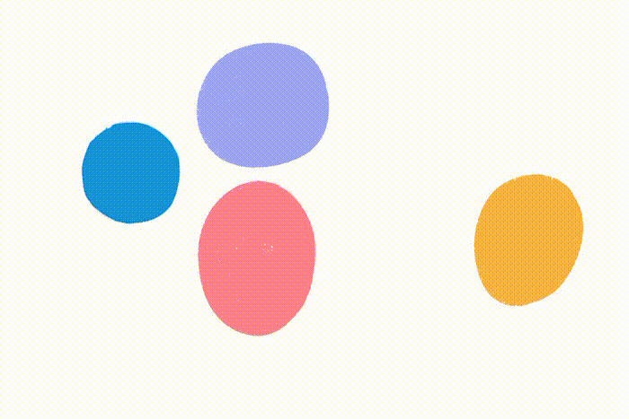
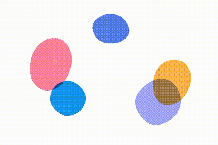
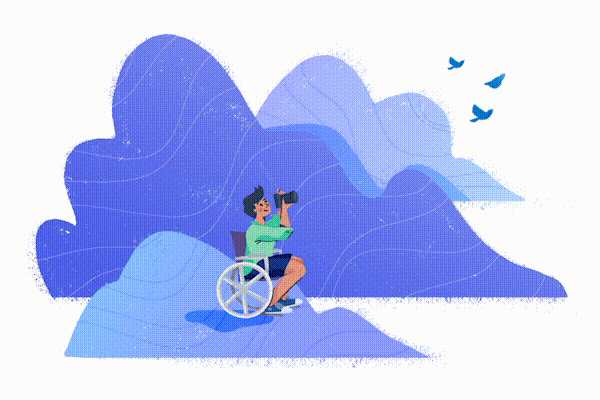
Each illustration would feature a loop of abstracted animation that takes its cue from one of our five brand values. These would be framed by the abstracted value shape, and then have a character added.
The abstract animation loop adds another layer to the story already being told by the illustration. By keeping things simple and looping, we give the impression of viewing one sustained moment.
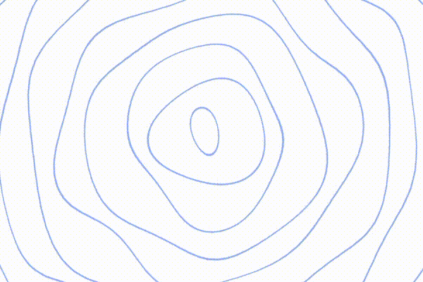
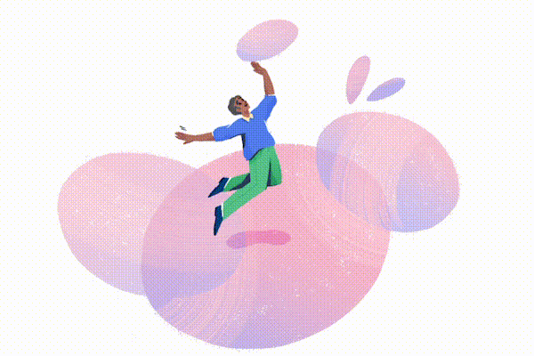
<image-caption>1- Abstracted animation for “Curious”</image-caption>,1- Abstracted animation for “Curious”
Putting ideas into motion
Using the formula above, we used the brand values to inspire a motion concept for each. These took some additional inspiration from different sources.
Helpful
A wave motion shows calm and ever-forward movement — inspired by the texture of clouds and the idea of a wave carrying our character along.


Trustworthy
An array of lines grows in a steady, organic flow — inspired by ocean waves and other ever-present natural forces.
Human
A cycling texture — inspired by someone painting with a brush.


Energetic
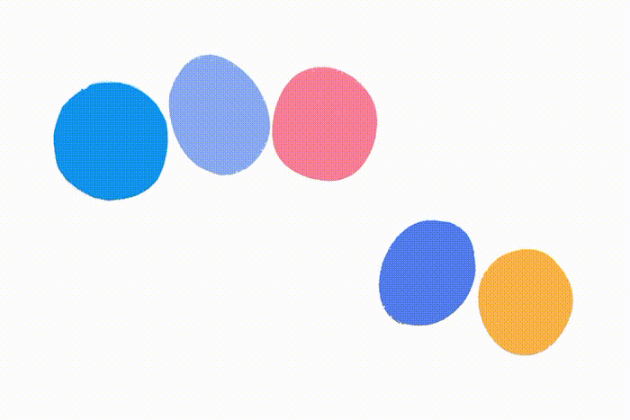
Lightly made brush strokes jump into random, different configurations, reflecting energy — inspired by dance steps hitting the ground.

Curious
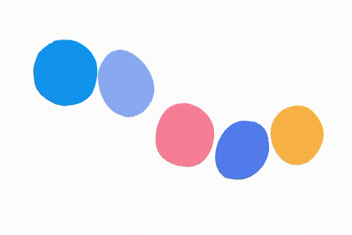
A pattern grows into one configuration, then into another — inspired by the reward of curiosity to see new patterns and arrangements.


Just a start
The Brand Handbook project is only the first step in a continued exploration of brand animation at Help Scout. The principles we uncovered during the project will likely evolve and grow, but the process of examining how to best use animation in service to a concept will be a constant in whatever comes next.
In this case, our list of brand values themselves sparked our thought processes and led us to how our illustrations should look and move. This was a lesson in what good can come when we let our craft — in this case, animation — take cues from the content of our message.