Behind the Scenes: The Design of Beacon


At the beginning of 2017 I sat down with a blank sheet of paper and began planning out the future of Beacon.
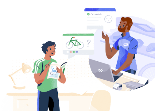
At the time, Beacon provided a simple and elegant way to browse Docs articles, but not a lot more. In response to overwhelming demand, I was tasked with adding live chat, but in a classically “Help Scout” way that didn’t overwhelm Customer Support teams.
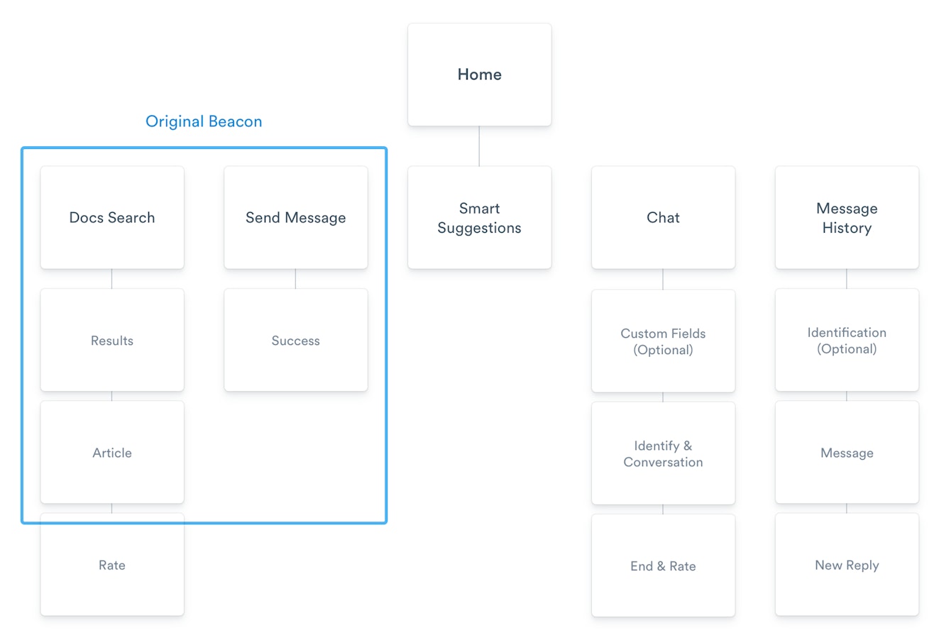
For context, this diagram shows the functionality we wanted to keep from the original (in blue) and the new things we wanted to add for the initial release. We had our work cut out!

As with any big project, we started by speaking to hundreds of customers and running exhaustive research to get a sense of how we should approach this task. This was always going to be a long play, so it was important to know what you wanted from the outset. What follows is the process from a design perspective and how we arrived at the Beacon you know and love today.
Concept, test, repeat
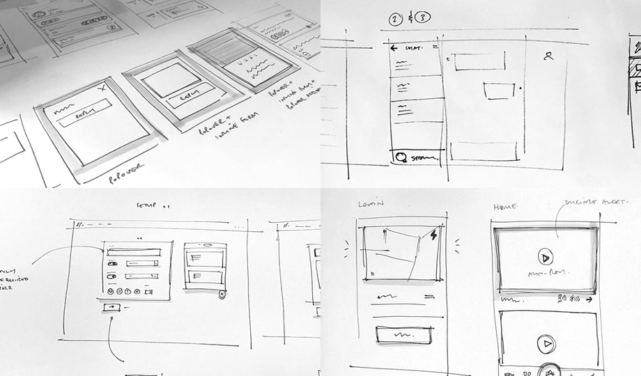
The process of designing big features like this is pretty standard — it generally starts by drawing hundreds of wireframes and figuring out which of them feels best. This was no different.
The idea was to be as messy as possible, but to figure out an end-to-end customer experience that felt simple and helpful. Not surprisingly, Beacon quickly got pretty complicated given the amount of new stuff we were trying to put in!

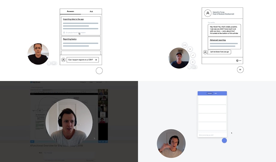
Since I work in Australia and my team is largely based in North America, almost every day I recorded a video of my various concepts and put them to the group for discussion.
Once we had an approach we were pleased with, we put scrappy, clickable prototypes in front of real customers to determine whether they could be easily used and understood. Generally speaking, this testing validated our assumptions, but in a few cases it revealed that we needed to simplify things further.

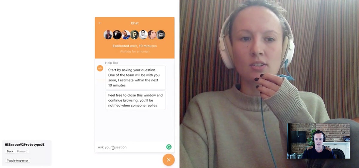
Of all the items raised by testing, I recall a couple of interesting observations that ended up defining how Beacon ended up looking and working:
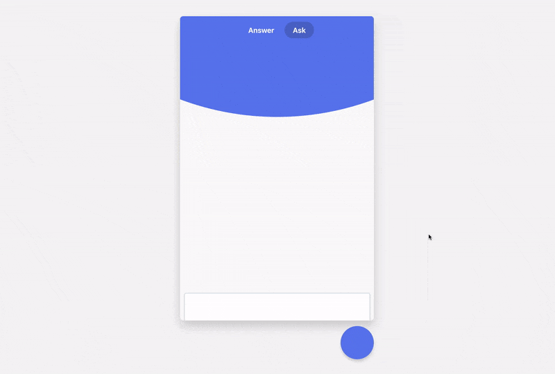
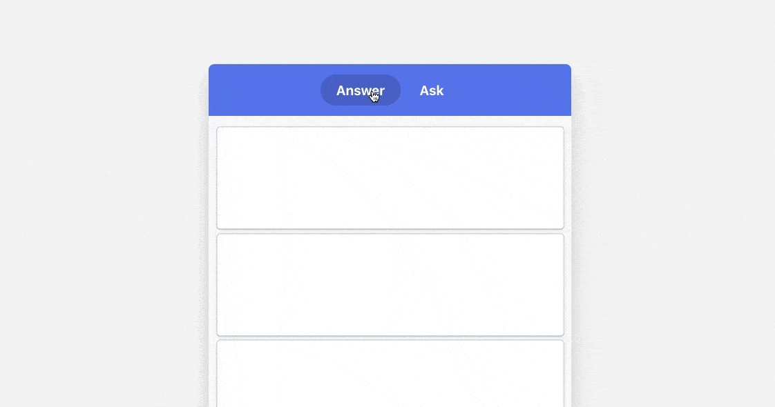
Navigation was confusing. Our prototypes required a lot of clicking to get between home, search, messaging, articles and chat — then an equal amount of wayfinding to go backward, forward, and to close various bits of UI. It was pretty overwhelming for such a tiny little tool, and it resulted in a lot of confusion , so it was definitely an area we needed to simplify.
People weren’t sure when/if they were talking to a real human. This was likely a hangover from how similar tools in the marketplace currently work, but people using our Beacon prototypes were skeptical of whether they were talking to a real-life human or a bot!
There were some things we couldn’t change. Everyone we tested our designs on had an inherent expectation of chat , be it from Facebook Messenger, WhatsApp or iMessage. Anything that deviated too much from those experiences was confusing and unnecessary. In early designs we tried reversing the order of a chat conversation, with newest messages at the top and oldest at the bottom. That format confused 100% of our testers.
Design
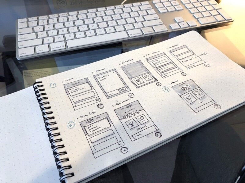
After numerous iterations and countless tests, we felt confident about the ideal user experience and moved onto the visual design phase — which, as always, began with sketching and trying lots of different ideas.
As is so often the case, by the time I got to this stage of the project I thought I had a clear idea of what I wanted Beacon to look like — but in reality I couldn’t find a design that really worked. Here are some of the failed concepts . . .

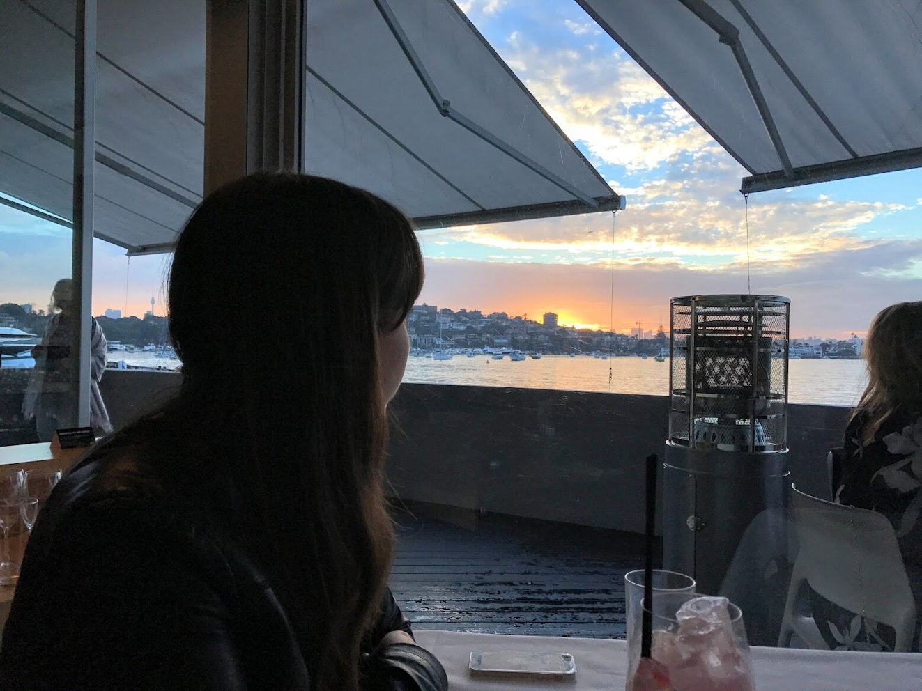
My main challenge was to fit all this great content into a structure that didn’t require a lot of navigation and buttons — something I couldn’t quite get right. No matter what I tried, there always seemed to be buttons, arrows, and navigation all over the place. That was the case until one afternoon, when having lunch with my wife at a restaurant overlooking Sydney Harbour, where I noticed how the islands and headlands were “stacked” by perspective . . . which gave me the idea to take a similar approach with Beacon.

The idea would be to stack content on top of each other, like an app on your phone, rather than use a traditional back-and-forth structure, like you see on the desktop. I’m certain my wife wasn’t pleased by the turn in conversation, but it was a definite turning point for the design of Beacon.

Building Beacon
At Help Scout, once we figure out the rough outlines of a design, we usually like to jump straight in to building a working version in code. Static designs make a lot of assumptions and can only take the product experience so far without real content, so we like to get into a working prototype fairly quickly to help inform the best solutions.
For Beacon, we built a beta and used it in the Help Scout app to get a feel of how it worked in a real-world scenario. This approach meant there was lots of back-and-forth with engineers throwing out certain things that made sense in concept but not in reality.

About 10 months after it all began, when we were happy with the progress and ready to open it up to customers, I flew to Canada to work directly with our UI Engineer, Jon “Q” Quach, ahead of the public launch. While we’re huge advocates of a remote-first culture, some things — like finessing interactions and animations — are better done in person. Q and I worked for a solid 10 days together to polish Beacon to a customer-ready state.
A designer’s work is never done
We’re not ones to revel in success, and as soon as Beacon was launched we got sucked back into the next phase of the project. As with everything we launch, we listen closely to the feedback of customers — of course Beacon was no different, and the feedback was useful in helping us choose which areas to focus on and improve. So while the Engineering team set out to work on updates, I turned my attention to how I could improve the visual design and experience of Beacon . . . after all, a design is never finished. Also, I’m a perfectionist.
I broke my work into two categories: improving the overall product by creating a consistent visual style, and enhancing Beacon using animations and transitions to present a smooth and noteworthy user experience.
Re-designing a new product
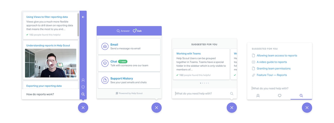
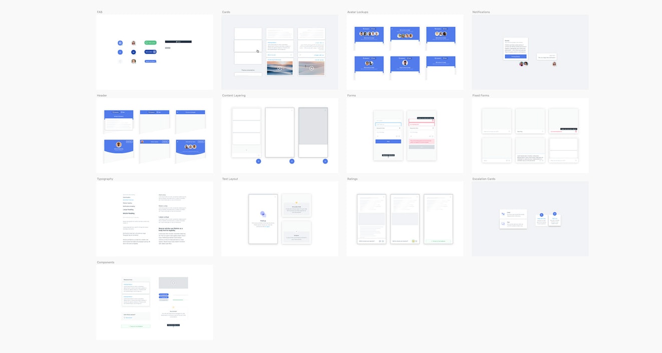
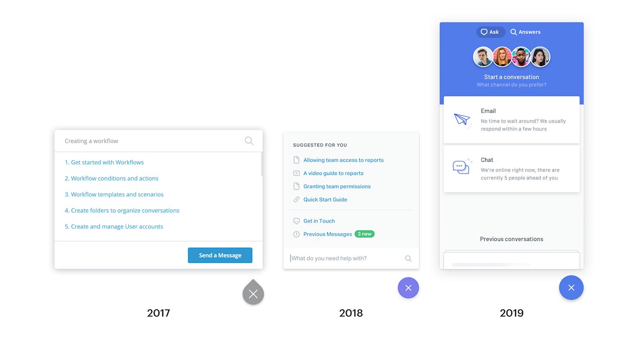
The first thing I set out to do was to build what is now known as the Help Scout Design System (HSDS) — a huge library of UI and coded components that covers every part of Beacon, defining how things look, feel and behave. This involved re-designing and re-building every part of the initial Beacon app, not just for the sake of consistency, but also to help us scale and add new features and improvements.

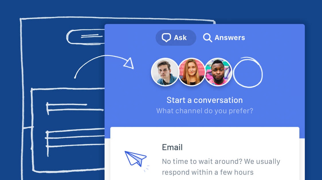
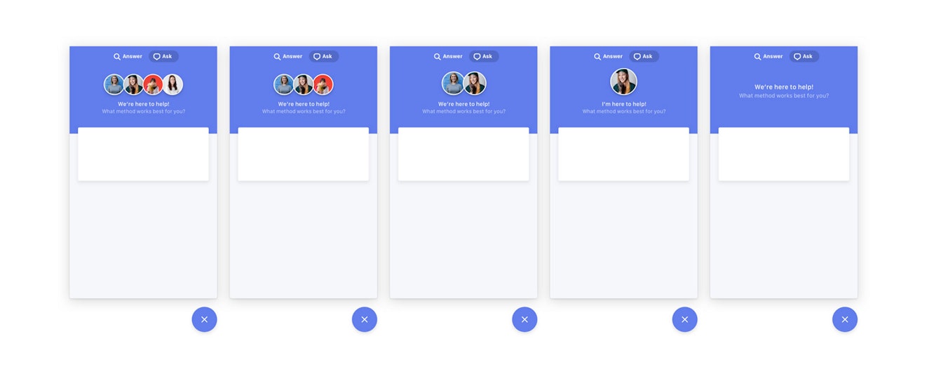
During this time I also had a little fun with some design details, like overlapping content, making user avatars a more central theme, and introducing a few more fun touches. Once Beacon was live we also learned a lot about changing the design to suit the dynamic content that may be present. For example, you can see below how the same design changes depending on how many avatars are available (featuring my favorite YouTuber, Simone Giertz).

Making a difference with animation
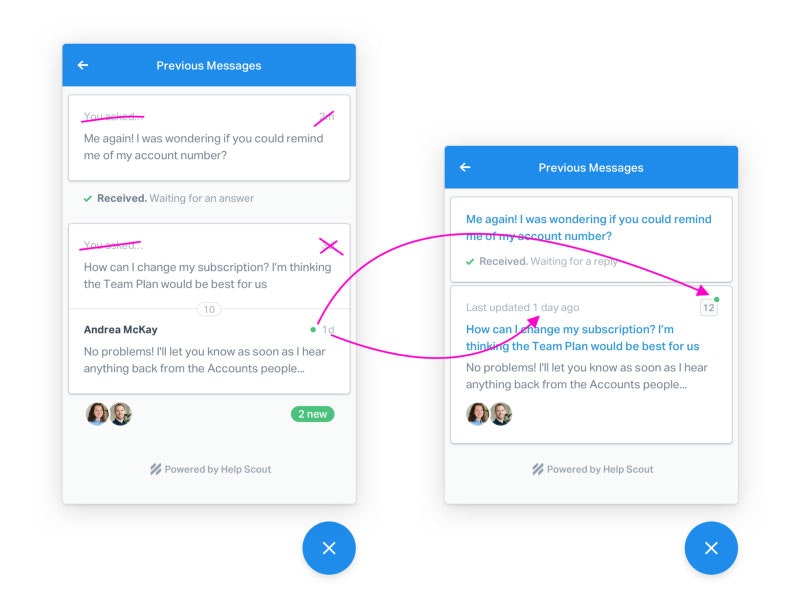
Improving Beacon with animation was a larger challenge, namely because I wasn’t exactly sure what needed improving, or where to start. At the time, Beacon was fairly static in the sense that it felt like a series of linked screens, rather than a smooth end-to-end experience. So instead of adding arbitrary animations, I decided to focus on anything that served to help indicate where content was coming from and what clicking on a certain UI was likely to do.
There were hundreds of explorations — some didn’t make the cut, and others you’ll find in the app today. These were generally communicated to the Engineering team through videos and prototypes that I coded to demonstrate my intention — anything to avoid another flight across hemispheres.
What’s yet to come
We’ve come a long way since those early sketches, but we’ve only just scratched the surface of what we want to achieve with Beacon. As for the design side of things, the process will remain the same — we listen to feedback, test our ideas, and keep pushing ourselves to produce something you and your customers love to use.

It’s always nice to look backward as a reminder of where we started — for Beacon, that was a humble little Docs widget which grew into a full-service documentation and chat product. Who knows where we’ll be in a couple more years, but I’m excited to find out.

Buzz Usborne
Buzz is the Principal Designer at Help Scout, working from a tiny surf town on the East coast of Australia. When he’s not designing you’ll find him on a beach or up a mountain with his wife and two kids.


