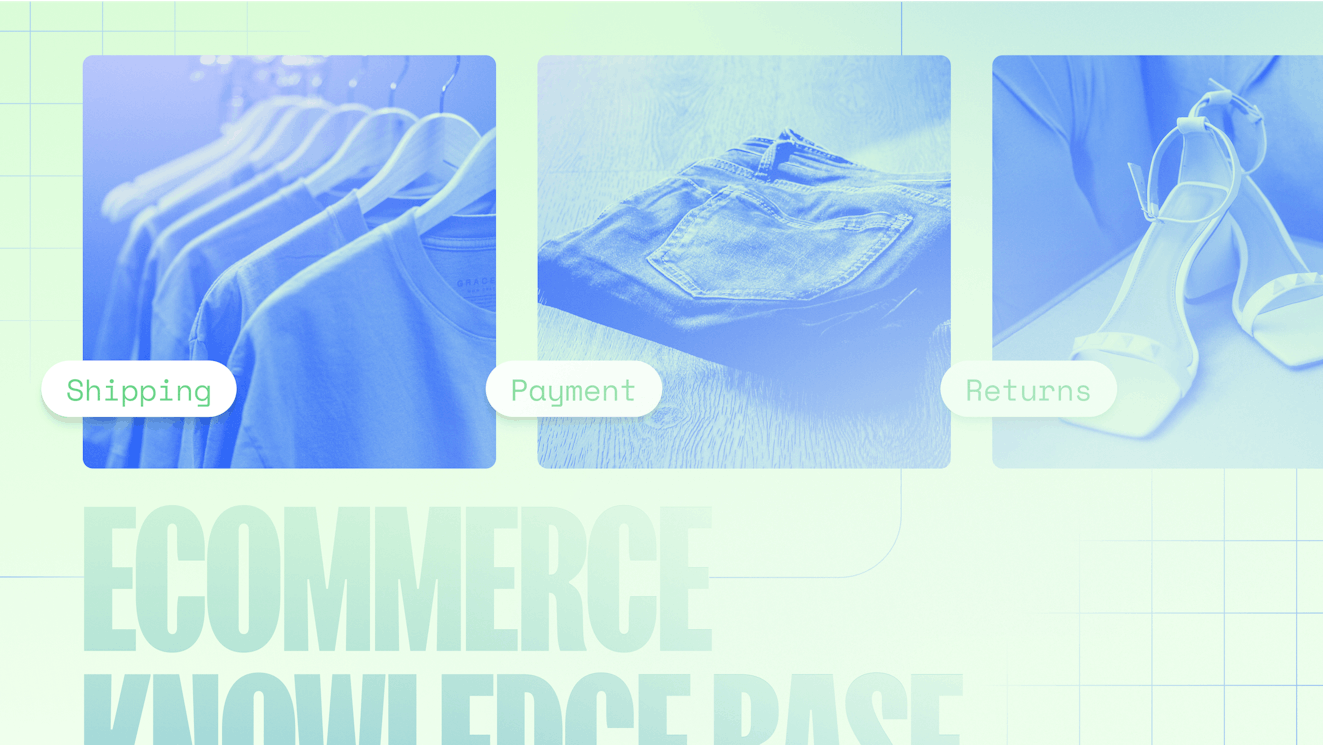
16 Ecommerce Knowledge Bases That Go Beyond the FAQ

Help articles might not always be at the top of your reading list, but when your order has gone missing, a size chart is making no sense, or your new speakers won’t cooperate, a well-designed knowledge base becomes your saving grace.
The most successful ecommerce brands understand this dynamic.
They’ve transformed their help centers from boring afterthoughts into extensions of their sleek product pages — beautiful, on-brand, intuitive, and actually helpful.
In this article, we’re highlighting 16 ecommerce companies that have mastered the art of knowledge base design. Through great search functionality, smart AI integration, clear communication, and product-specific troubleshooting workflows, these ecommerce knowledge base examples prove that self-service can be both effective and satisfying.
Creating an ecommerce knowledge base with Help Scout’s Docs
Help Scout offers Docs, an easy-to-use, accessible knowledge base builder. Docs comes with a rich text editor, AI-powered editing tools, and customization options, making it a great choice for ecommerce teams looking to create a robust, media-rich help center without coding.
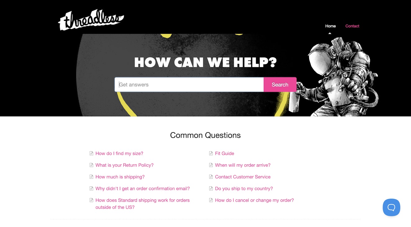
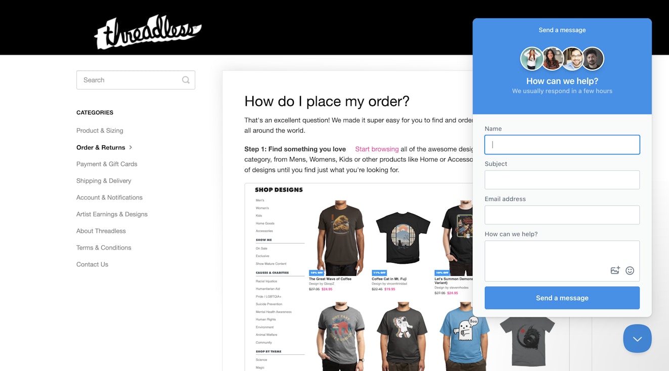
To give you an idea of how some brands use Docs to support their ecommerce business, let’s take a quick look at the help center for Threadless, a popular online community and ecommerce business.

Knowledge base site design
Your help center should look and feel like your online store. Help Scout lets you match your main brand colors and style, giving customers a seamless, trustworthy experience.
You can easily customize everything, from logo to colors to domain, without needing any coding skills. Of course, if you want to control every detail, you can also use CSS to customize your knowledge base as much as you’d like.

Recommended Reading

Knowledge base organization
If your knowledge base is just a handful of FAQs, structure isn’t a huge deal. But as you launch new products and your brand grows, so will the questions your customers have — and that’s when chaos can sneak in.
When things start to scale, organization becomes your best friend. With Docs, you get a three-tiered hierarchy to help you keep your content organized and intuitive.

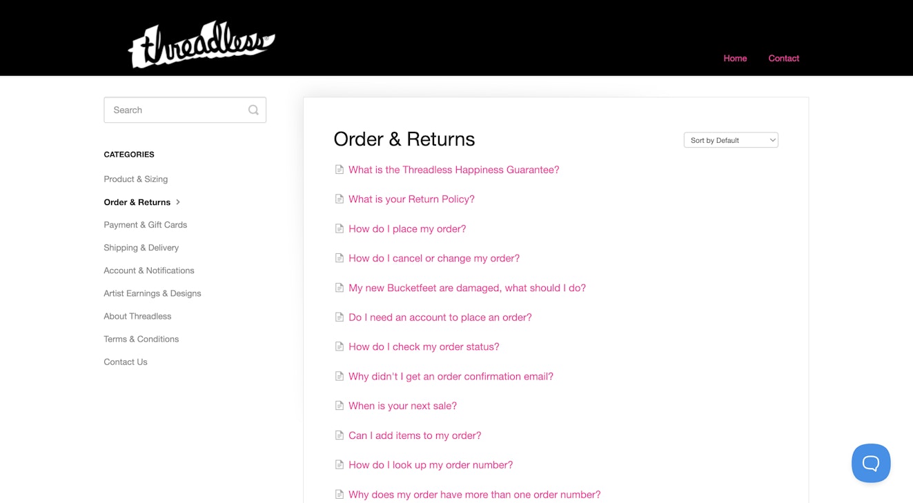
Collections: Collections are your top-level organization tool. You might start with just one collection, then you can add more as your content grows. Think of these as the main sections of your help center.
Categories: Categories are the middle layer of your organizational system and let you sort out information by topic within a collection. While Threadless has chosen to have all of their content in the same collection, they have several content categories, such as “Product & Sizing” and “Shipping & Delivery.”
Articles: Articles are the core content of your knowledge base. Each one should focus on answering a specific question or solving a particular issue. For example, Threadless has a specific article about “how to place an order” in their “Order & Returns” category, guiding customers through the process step by step.
Knowledge base search
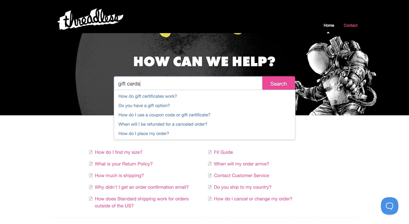
Most people don’t come to your help center to browse; they come with a question. That’s why strong search functionality is just as important as the content itself. In Docs, the search bar takes center stage, helping users quickly find what they need.
As users type, suggested articles appear in real time. For example, someone searching for “gift cards” sees the most relevant results right at the top. It’s quick and intuitive, and it gets them to an answer faster.

Easy access to support
Docs is designed to make answers easy to find, but your customers may require different support options based on where they are in their journeys. Beacon, Help Scout’s web widget feature, accounts for that need by letting you choose what you want each individual Beacon to display.
Surface knowledge base articles when customers visit product pages or your main site, offer live chat for help center visitors who may be stuck, or provide a contact form when you’re offline so that your team can follow up. Your customers can even tap into AI Answers to instantly get AI-generated answers to their questions based on sources like your help content or website.
In Threadless’s case, they’ve opted for a contact form, making it super easy for customers to reach out if they need more assistance.

16 inspiring ecommerce knowledge base examples
From intuitive layouts and smart search to personalized support flows and AI-powered answers, the 16 ecommerce knowledge base examples below show how great self-service can elevate the entire customer experience.
1. IKEA

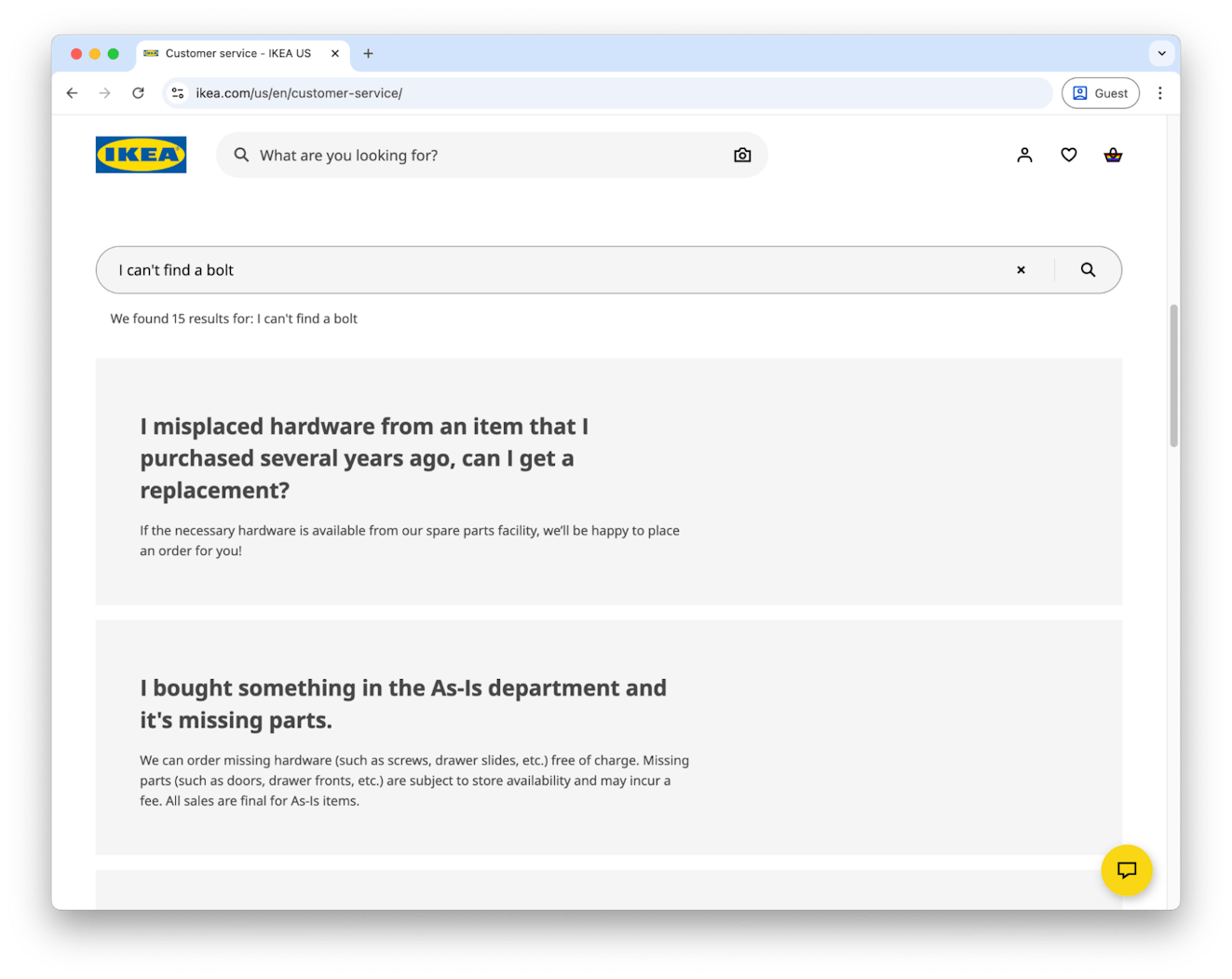
AI has touched nearly every aspect of business, and knowledge management is no exception. Natural language processing (NLP) and large language models (LLMs) make it much easier to understand the intent behind a user’s question and then surface the right information. IKEA uses AI in their help center to display the appropriate content quickly and efficiently.
Tip: Look for support tools that offer smart search assistants, like Help Scout’s AI Answers, which pulls from your help center to answer customer questions naturally.
2. Amazon

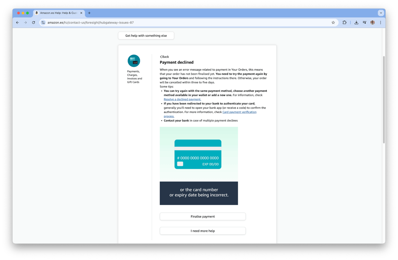
Amazon may not be known for its slick design, but it delivers an incredibly efficient shopping experience. Its knowledge base reflects the same philosophy: basic design but packed with helpful content. The example above shows a clear explanation, relevant links, an illustrative image, and action buttons to guide users toward resolution.
Tip: Don’t underestimate functionality over flash. A well-structured knowledge base article with visuals, helpful links, and clear call-to-action buttons can do more to support users than fancy design alone. Prioritize clarity and content.
3. Sonos

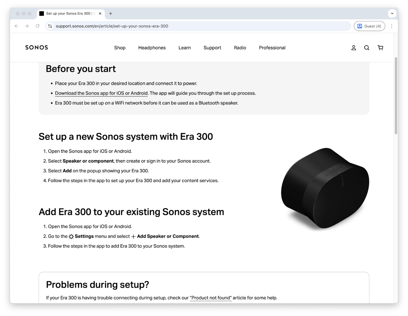
Sonos does an excellent job removing ambiguity by walking users through each setup step clearly and visually.
Even small details, like naming the exact button to press — “Select + Add Speaker” — help reduce errors and build confidence in the process. Additionally, the article clearly differentiates buttons by using bold text.
Tip: Write help articles as if you’re guiding a beginner. Break down each step, avoid jargon, and include interface cues or visual references where possible. Clear instructions prevent frustration (and fewer frustrated users means fewer support tickets).
4. Shopify

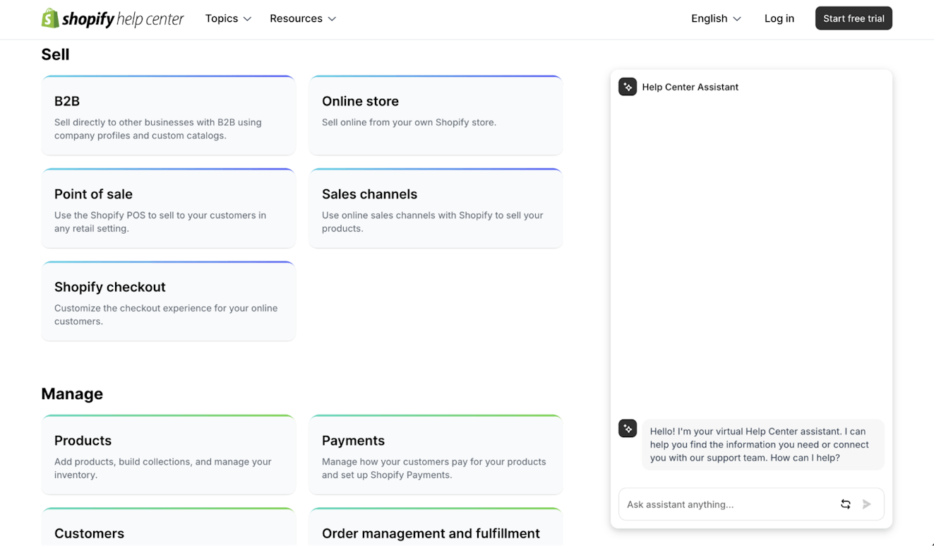
Shopify understands that their platform serves very different users with distinct needs, from brand new ecommerce companies to massive global brands.
Rather than forcing everyone through the same generic help experience, they organize their knowledge base around what merchants actually want to accomplish — whether that’s setting up sales channels, managing products, or handling order fulfillment. This task-based organization makes it easy for users to dive straight into relevant content.
Tip: Structure your help content around user goals, not your internal product features. Group related topics under clear action-oriented categories so customers can quickly find solutions for what they’re trying to accomplish instead of hunting through technical product divisions.
5. Nike

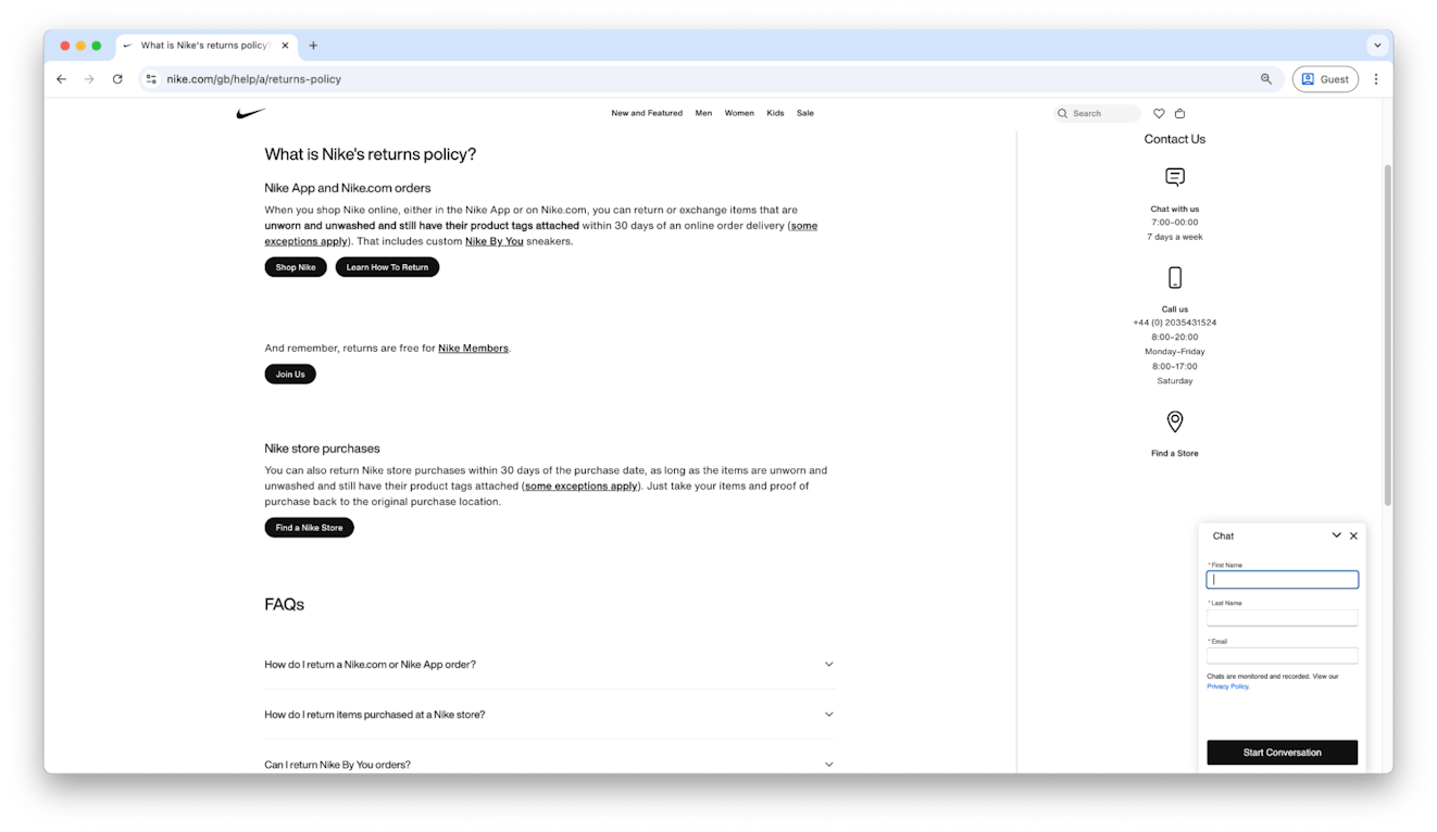
Almost every live support option involves some wait time. That means the ideal scenario is giving customers the ability to answer questions on their own with a great knowledge base article while not burying your contact options.
Nike gets it right by offering chat or phone support after users view an article, making it easy to escalate when self-service isn’t enough.
Tip: A great knowledge base shouldn’t make it impossible to reach your team. Include clear contact options on your homepage and within articles. Most customers will try to help themselves first, but they’ll appreciate knowing human help is just a click away.
6. Sephora

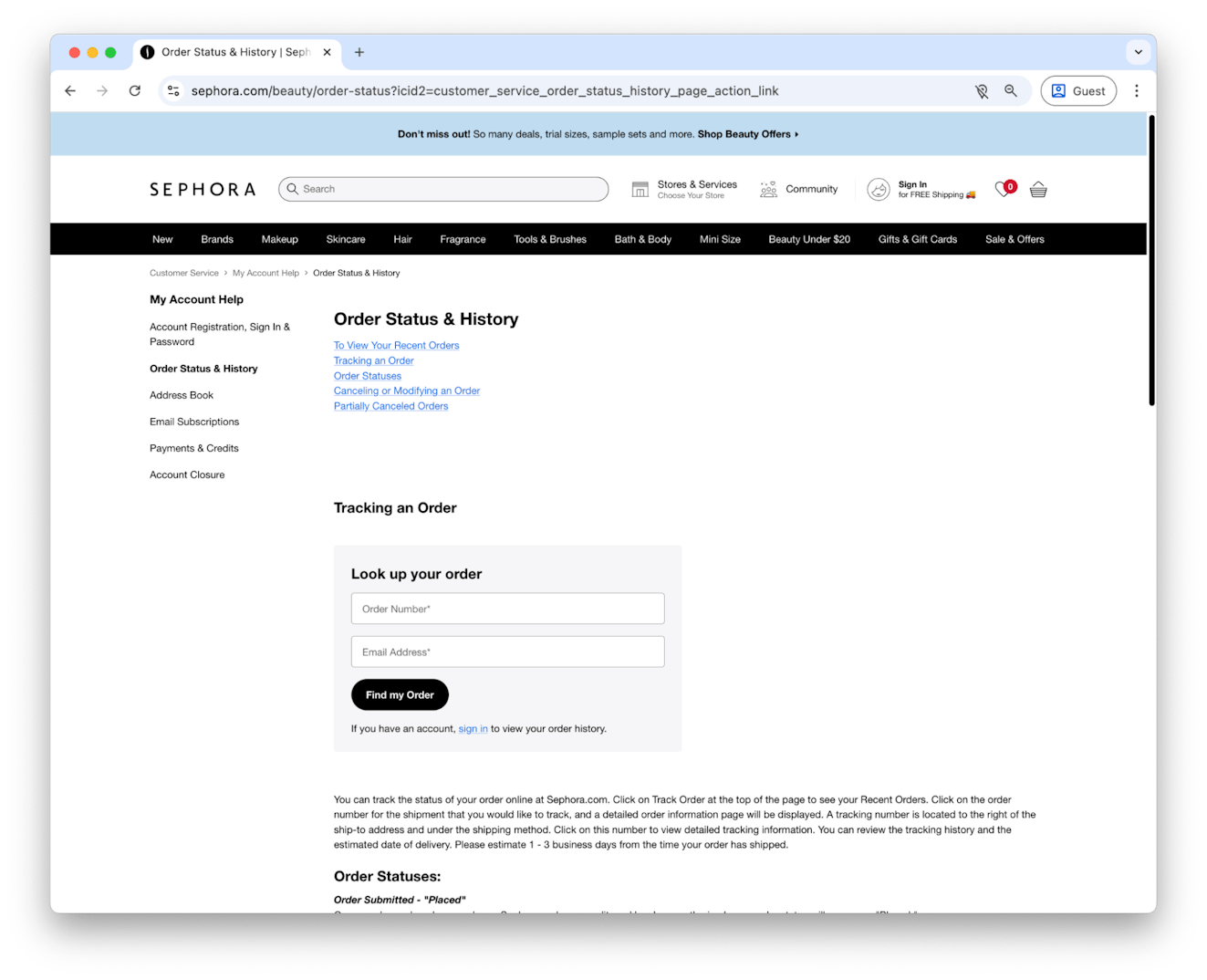
Some knowledge base articles need to be comprehensive to truly help, but long content can easily overwhelm readers. Sephora solves this beautifully with anchor links that let users skip to exactly what they need, plus a fixed table of contents for easy navigation throughout the article.
Tip: Long doesn’t have to mean lost. Break up detailed articles with jump links, bold headings, and a persistent table of contents. This approach improves readability and helps search engines surface your specific content more effectively.
7. Coterie

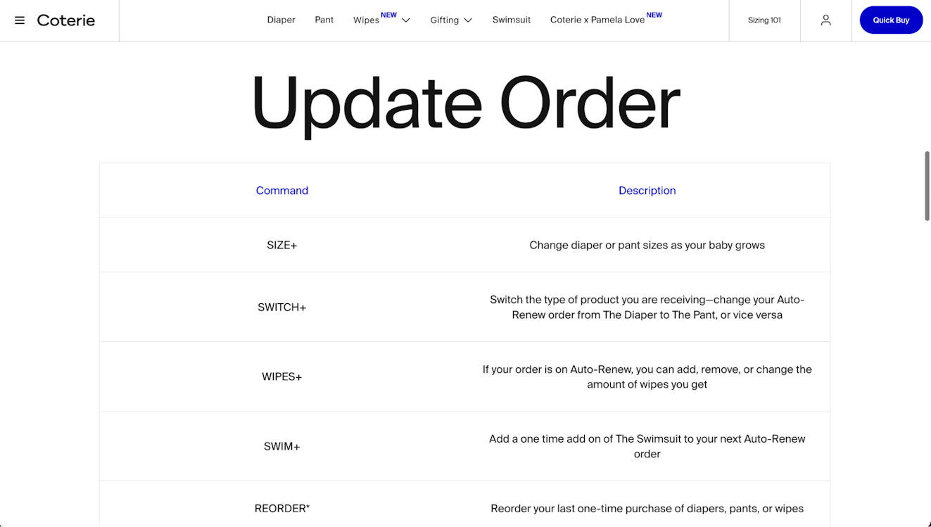
Coterie, the premium diaper brand, takes a novel approach to customer support with their text-based order management system.
Instead of forcing parents to navigate a website or app when they’re juggling a crying baby, customers can simply text commands like “SIZE+” to change diaper sizes or “SHIP NOW” when they’re running low. It’s support that fits seamlessly into the chaos of parenting.
The image above is a great example of a knowledge base article that is straight to the point. It makes it easy for customers to look up a command when they’re on the go and need to make a quick change to their order.
Tip: Meet customers where they already are, not where it’s convenient for you. If your audience is constantly on the move or multitasking, consider support channels and a knowledge base format that works with their lifestyle — whether that’s SMS, voice commands, or mobile-first interfaces that actually work with one hand.
8. Apple

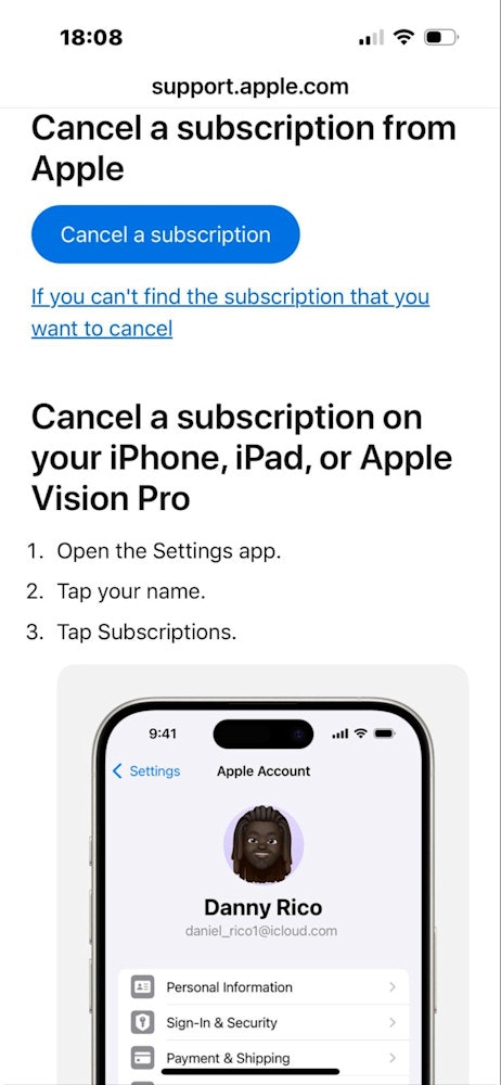
Apple’s knowledge base demonstrates that clarity beats complexity every time. Their step-by-step instructions use plain language, simple titles, and strategic images that clarify tricky processes without overwhelming the reader.
Tip: Remember that mobile users make up a huge portion of help center traffic. Test your articles on mobile devices to ensure images load quickly, text stays readable, and navigation remains intuitive on smaller screens.
9. Blue Bottle Coffee

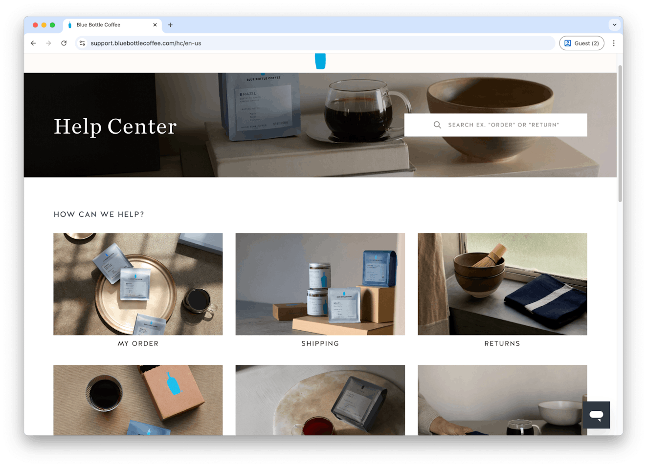
Just like the design of your ecommerce website, the design of your knowledge base matters. Blue Bottle Coffee nails this by carrying over the brand’s relaxed, elegant aesthetic into its support center, making even problem-solving feel on-brand.
Tip: Your knowledge base is still part of your customer experience, so don’t treat it like an afterthought. Invest in design that reinforces your brand and makes support feel like a natural extension of your product.
10. Vueling

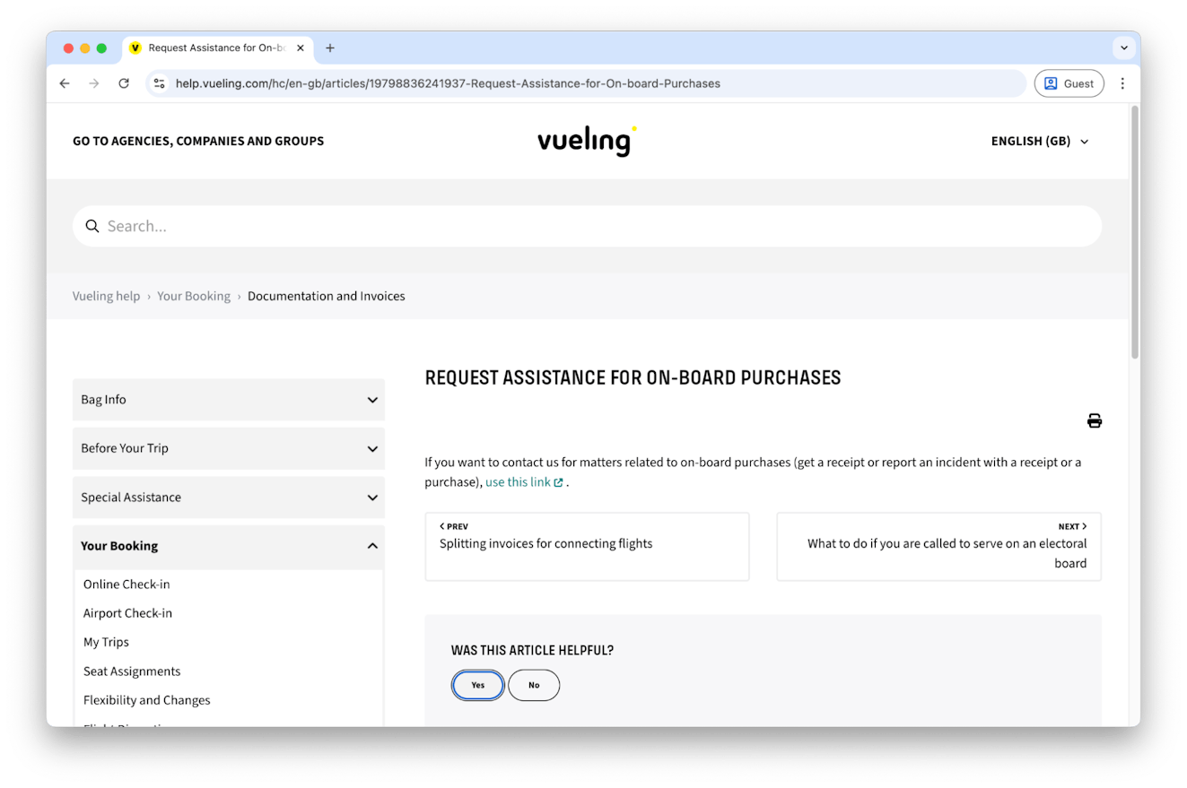
Strategic linking is an art, and Vueling’s knowledge base puts on a clinic of how to do it well.
Vueling’s articles include helpful links that direct customers to related information without overwhelming the main content or sending readers down rabbit holes.
Tip: Link strategically, not excessively. Every link should feel like the logical next step for readers who need that specific information. Too many links create decision paralysis and pull focus from your primary message.
11. Reformation

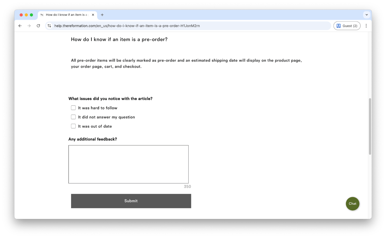
Clothing brand Reformation asks customers for feedback directly on their help articles, using simple checkboxes and an open-text field. This gives the team clear signals on what content needs attention and what’s working well.
Tip: Your knowledge base should evolve with your customers’ needs. Add quick feedback options to every article — even a simple thumbs up/down can reveal which content helps and which leaves people hanging.
12. Wayfair
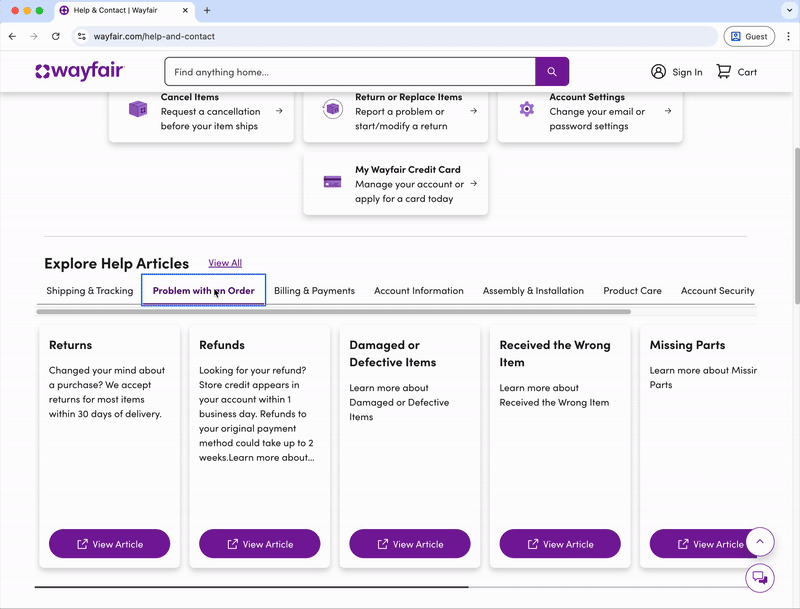
Furniture ecommerce company Wayfair has a knowledge base that stands out with a well-designed homepage.
It features a unique horizontal layout for browsing articles and clearly organized categories like Account Settings and Returns, making navigation feel intuitive rather than overwhelming.
Tip: Don’t be afraid to experiment with layout and organization. Test different ways of presenting your categories, and measure what actually helps customers find answers faster. Sometimes unconventional approaches work best for your customers.
13. Momentous

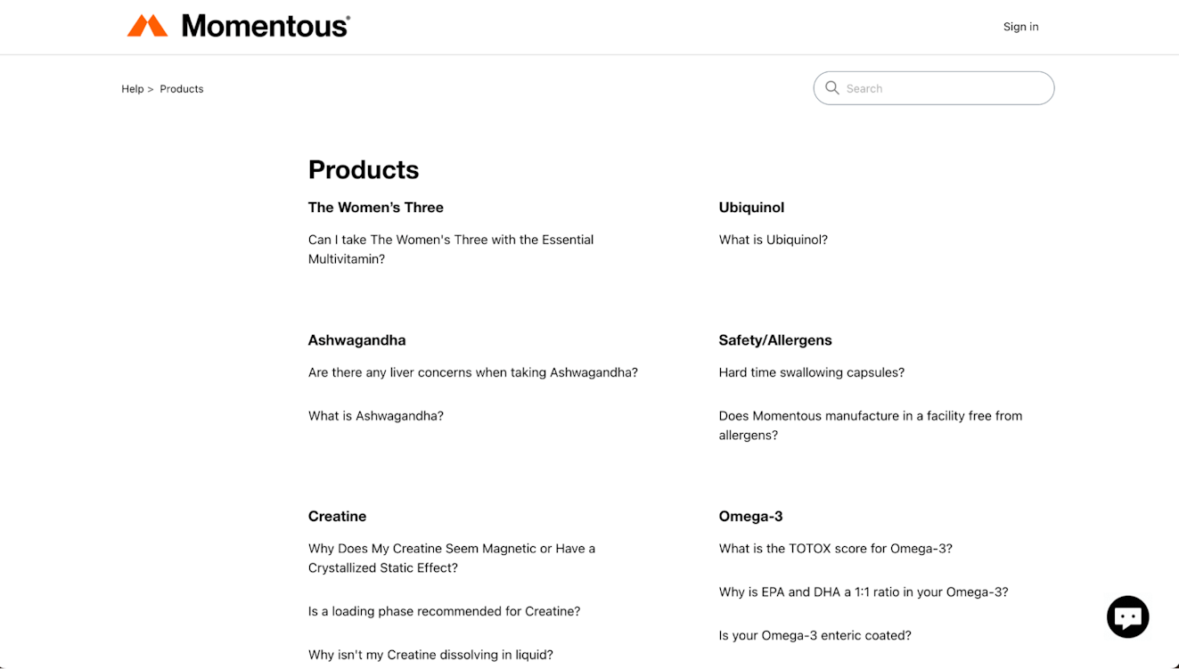
Supplement brand Momentous organizes their knowledge base around specific products and ingredients rather than generic categories.
Instead of broad sections like “Product Information,” they have dedicated areas for each supplement (Ashwagandha, Creatine, Omega-3, etc.) with targeted FAQs that address the unique questions customers have about each ingredient’s effects, usage, and safety.
It’s a great example of using an ecommerce knowledge base to educate and engage customers (and it probably helps their knowledge base SEO, too).
Tip: When your products require education, organize content around what customers actually want to know about each item. Product-specific sections with relevant FAQs help customers find detailed answers without sifting through irrelevant information about other products they’re not considering.
14. Ace & Tate
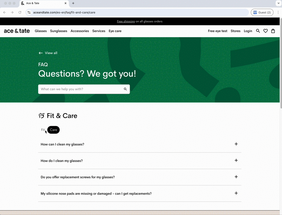
Dutch eyewear brand Ace & Tate organizes its knowledge base around how customers actually think and search, not around internal product categories. The visually engaging subcategories make browsing feel natural and intuitive.
Tip: Structure your content around customer journeys, not company departments. When you group information based on what people are trying to accomplish, you’ll create a more intuitive navigation experience.
15. Dyson

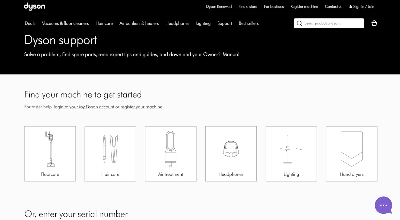
Dyson’s knowledge base shifts from generic support into personalized assistance by letting users select their specific Dyson device upfront. This simple step makes every article instantly more relevant and actionable for the specific product someone owns.
Tip: Product-specific content eliminates guesswork and builds confidence. If you’re an ecommerce brand with many different products, use device selectors, model sections, or targeted content paths to help users find solutions tailored to their exact situations.
16. MAAP

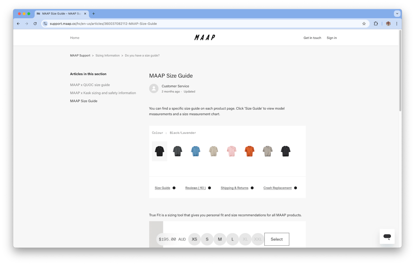
Australian cycling apparel brand MAAP proves that visuals can replace walls of text. Instead of lengthy sizing descriptions, they use clear product images and visual guides that help customers make decisions quickly and confidently.
Tip: When text gets unwieldy, let images do the talking. Size charts, product comparisons, and step-by-step visuals often communicate more effectively than detailed written explanations, especially for mobile users.
More tips on building a great knowledge base for your ecommerce store
A great ecommerce knowledge base can answer questions with clarity, speed, and style. When shoppers are browsing around your site or customers have questions about their orders, your help center becomes an invaluable resource to help drive more purchases and to create customer and brand loyalty.
Whether it’s using visuals strategically, structuring content around customer needs, offering intelligent search, or making human support easy to find, the goal remains the same: help customers help themselves efficiently and confidently.
With the right knowledge base software and a customer-first approach, your help center can become as impressive and conversion-friendly as your storefront.
Larry Barker
Larry has been working in and leading customer experience teams for over a decade. He currently leads CX & Operations for Teamshares, in addition to running Supported Content, a niche content marketing company that creates expert CX content.


