Knowledge Base Design Tips for Better Self-Service Support


Product teams leverage user experience resources, road maps, and customer interviews to build great products. In the same way, customer support teams have the opportunity to treat their knowledge bases like products by creating great content, focusing on design, making data-driven decisions, and remembering the mission of their team: to help customers.
7 knowledge base design best practices
Here are seven knowledge base design best practices every team should follow, including examples both from my time at Lucid as well as from Help Scout.
1. Focus on design
Like any other product, the design of your knowledge base is incredibly important. Customers want answers to their questions quickly, but customer interactions within your knowledge base also present opportunities to thrill them with great design.
For example, add a prominent search feature to allow customers to easily search for relevant articles. Additionally, you can add links to your most popular content to the homepage of your knowledge base to allow people to access important content without ever leaving the homepage.
As we redesigned our knowledge base at Lucid, we realized that it didn’t answer every single question customers had. To help people more effectively, we needed to create a simple way for them to contact our support team from our knowledge base.
After researching great designs for “Contact Us” pages, the team implemented an easy-to-use page that directed customers to different teams based on their questions. Not only was the design of the new page great for customers, it helped our team provide better responses because questions were routed to the team that could best answer them.

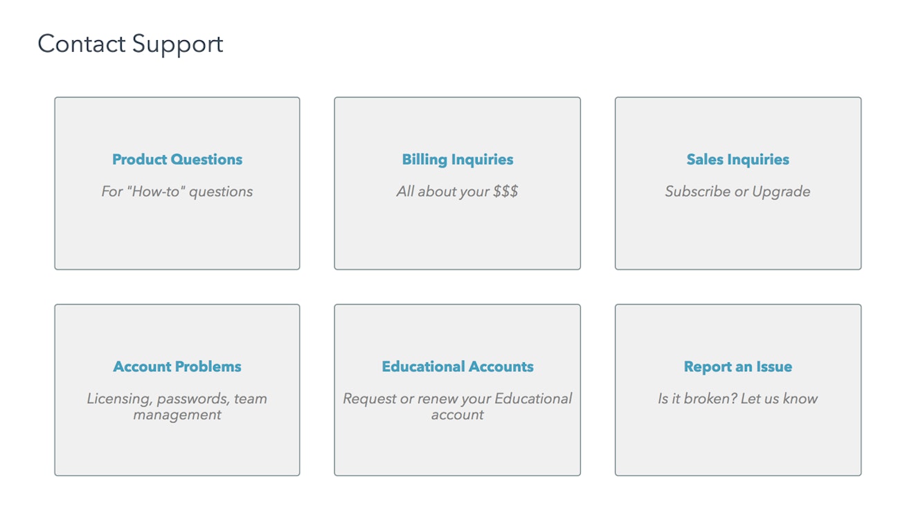
This design improved the customer experience with our “Contact Us” page and improved our team’s experience in dealing with questions, leading to faster, better answers for our customers.
2. Write clear, concise, digestible content
Customers come to your knowledge base when they have a question about how to use your product. They want answers. Give them the answers they seek by writing clear, concise, and easily digestible content.
Take time to ensure your documentation is up to date with the latest UI changes and that the steps outlined actually match what your customer will see in the product. Keep it simple: Give people the answers they need, and get them back into the product as quickly as possible.
At Lucid, when we began to invest heavily in our knowledge base, we found that much of our content was out of date. Many articles had incorrect information, contained typos, or were simply poorly written. Before we began updating anything else, we invested time updating these articles to ensure the content was clear, concise, and correct.


We also designed a new article layout so articles were organized within accordions, allowing customers to select the content most relevant to their question without having to read through an entire article. These changes increased bounce rates on our article pages (a good thing — more on this soon!) while decreasing time on the page, meaning the changes helped people quickly get the right answers to their questions.
3. Use the wording your customers use
You might use your own marketing terms to describe features or elements of your service, but customers may never search for those terms. Review support conversations and chat transcripts to understand how customers talk about your offerings, and include those terms.
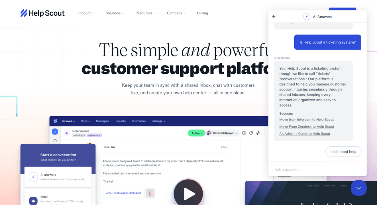
For example, Help Scout doesn’t use the word “ticket” when describing a contact from a customer, instead favoring the more friendly term, “conversation.” While conversation is more personable and fits better with Help Scout’s approach to customer support, it may not be the term that customers use when they are searching the knowledge base.
To help alleviate any confusion, a definition of “conversation” is included in the company’s getting started guide, ensuring that new customers start off with a general understanding of how the feature is referred to in Help Scout.


In addition, AI Answers, the platform’s AI-powered smart assistant, is able to use information from prior customer conversations and the Help Scout knowledge base to recognize the term “ticket” in a customer query as a synonym for “conversation.”
This means the customer can get help quickly, no matter the terminology they use when asking a question.

4. Design for readability
Help your readers understand your content by applying simple knowledge base design tips like contrast and white space. If you’re interested, Help Scout has an article dedicated to document design best practices.
Take a look to get some ideas on how to make your content more readable.

5. Show content in-app or on your site
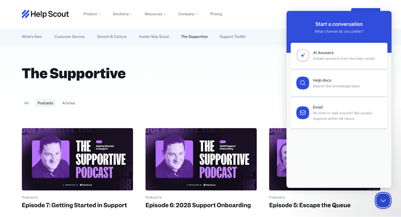
Rather than wait for readers to arrive at the front door of your knowledge base, make the information visible right where they need it inside your application or on specific pages. Tools like Help Scout's Beacon can let you easily show the most appropriate content for the customer’s current goal.
For Help Scout customers, Beacon access is available throughout the user experience so that people can ask AI Answers a question, browse help documentation, or reach out to support without leaving the product.


6. Connect your knowledge base to your contact points
One reason customers reach out for your help is that they just don’t know your knowledge base is there. Link to your knowledge base prominently from the places people can trigger a support question, and help them help themselves.
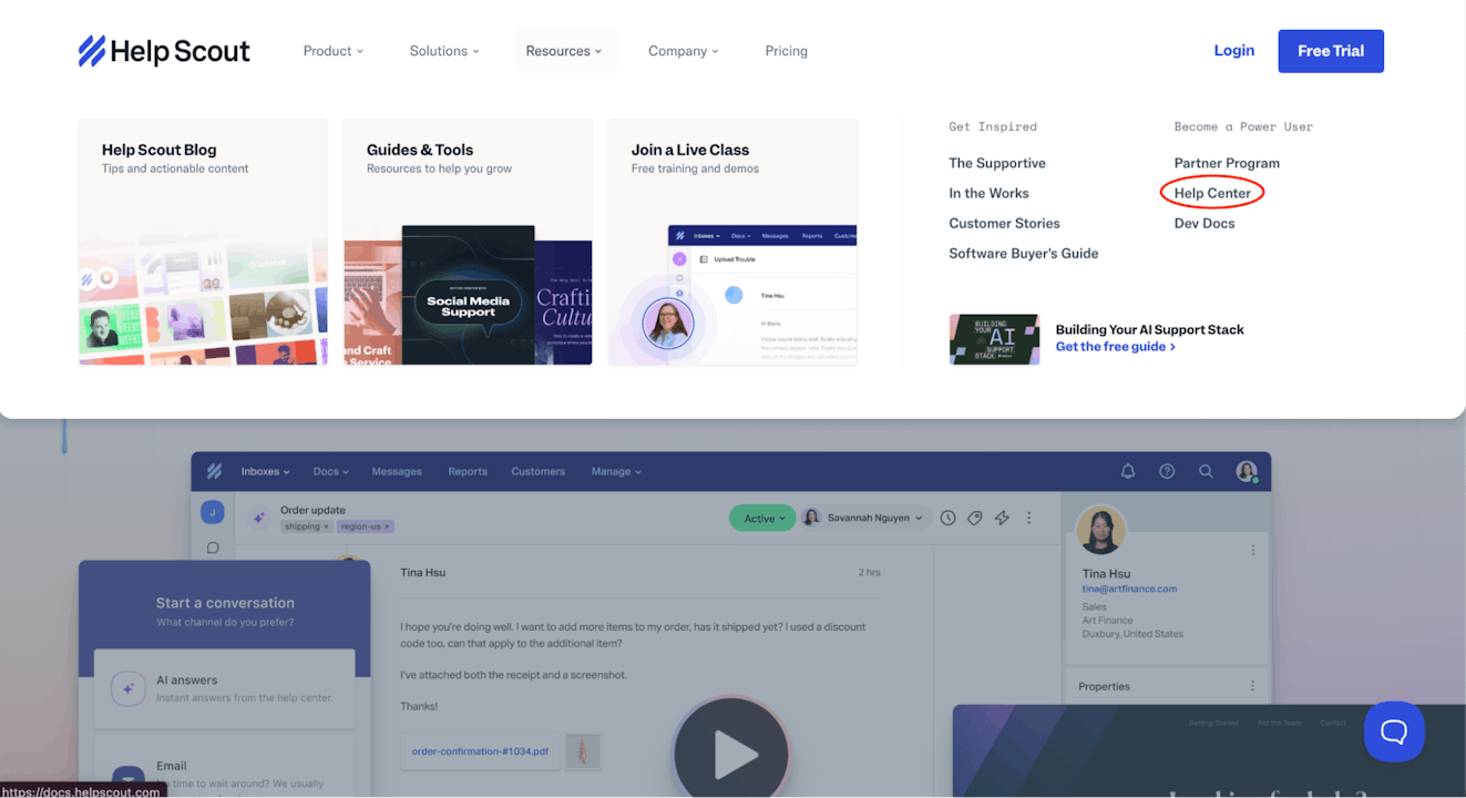
Help Scout customers can reach the help center from several different places:
From the marketing site’s resources menu:
From the site’s footer:

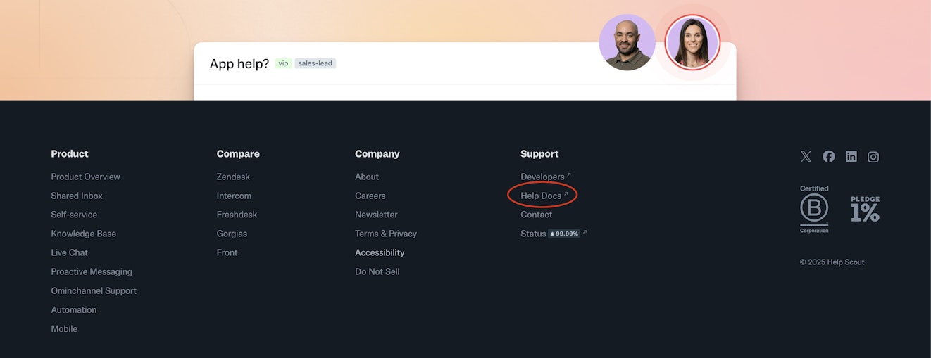
And from anywhere a Beacon is located, including on blog posts and within the product.

Essentially, anywhere a customer (or prospective customer) might be, Help Scout makes sure they have easy knowledge base access.
7. Make data-driven decisions
Data should drive every aspect of your knowledge base, from the content you write to how to design your help pages to how you identify potential improvements.
Digging into the reports that your knowledge base software provides will allow you to understand how customers interact with your knowledge base. In turn, that data will help you make better decisions about how to improve your knowledge base to better serve customers.
At Lucid, we came to understand, after much trial and error, that bounce rates can mean different things on different page types. A high bounce rate on your knowledge base’s home page is bad, because it means people leave before interacting with anything, indicating that they didn’t find the home page helpful enough to stick around.
That said, the same high bounce rate on an article page is good, as that indicates that people are able to find answers to their questions in the article before leaving the site to go back to the product.
Once we understood bounce rates and how to make sense of the numbers, we were able to drop the bounce rate of our knowledge base home page by 14% by adding a “Popular Content” accordion to our home page that provides quick links to our most popular articles.

Metrics such as page views, bounce rates, and time on page can tell detailed stories of customer engagement. Take time to deeply understand this data, then make decisions based on your understanding. Data can act as a key to optimize user flows and help people access your content more easily.
Remember your goal: to help customers
At the end of the day, the goal of your knowledge base is to help your customers. Use these questions as guiding lights when making decisions about your knowledge base:
Does this help customers?
Will this answer the customer’s question quickly?
Can customers get back to the product easily after finding their answer?
If a new header or article layout doesn’t help customers, then it doesn’t make sense to implement it. If it passes this base test, then test it further, watch how it impacts key metrics, and iterate to improve the feature.
The key to creating a great knowledge base is simple: Treat it like a product! Write great content, focus on design, make data-driven decisions, and, above all else, help customers use your product more effectively.
Treating your knowledge base as a key product for your company enables you to create great customer experiences and build a strong, customer-driven product.