Help Scout Has a New Look


Today begins a new chapter for the Help Scout brand as we proudly unveil a new website and refreshed brand identity. Things may look a little different, but we’re still the same company committed to empowering businesses to delight more customers.
The last time we updated our brand was almost five years ago, in early 2019. We introduced a visual identity that relied heavily on hand-drawn illustration. At the time, this approach was an anomaly in SaaS — a differentiator that celebrated our warmth and helpfulness and accentuated the people-first, handcrafted approach to our product. For years, this creative direction served us well. It endeared us to many and cemented us as a company where design is valued. In time, however, relying on bespoke illustration began to stymie our creativity and made it difficult for our brand and marketing teams to move quickly.
Outgrowing a brand is painful
Our visual identity had become so core to who we were and how we communicated that it seemed impossible to move in a different direction. At the same time, we knew that our brand had started to distract people from who we really are: a group of product-loving, craft-focused people who are dedicated to customer delight. We’d been perceived as too earnest, our credibility had been questioned, and we were often referred to as underdogs.
Despite our discomfort, we knew we needed to shed these misconceptions and evolve our brand in a way that allowed us to be us, just with more room to grow. We wanted our brand to reflect the simplicity and power of our product while emphasizing our belief that human interaction is at the core of strong customer experiences. We also needed to be bolder and more opinionated in order to stand out in a competitive market.
So our in-house team embarked on a year-long journey to recreate and reintroduce ourselves with more polish, cohesion, and confidence.
Fortifying our brand foundation

Before we could dig into the outward aspects of the brand, it was critical for us to be on the same page about who we are as an organization — and who we want to be. We started by re-aligning on our brand’s foundation: our vision, mission, and values. We all agreed that our core beliefs still held true, but we needed to do a better job of articulating them, both internally and externally. Although our mission and company values had been well-defined for years, we’d never written a vision statement — the unifying declaration that encapsulates why we do the work we do.
So we distilled our core beliefs into one powerful vision for us all to work toward: A world where businesses treat customers like people. We refined our mission ever so slightly, and while our values remained the same at their core, we rewrote them to be more clear and actionable. These efforts kept the team aligned as we updated our brand messaging and got to work building our new visual brand.
A fresh take on an established brand

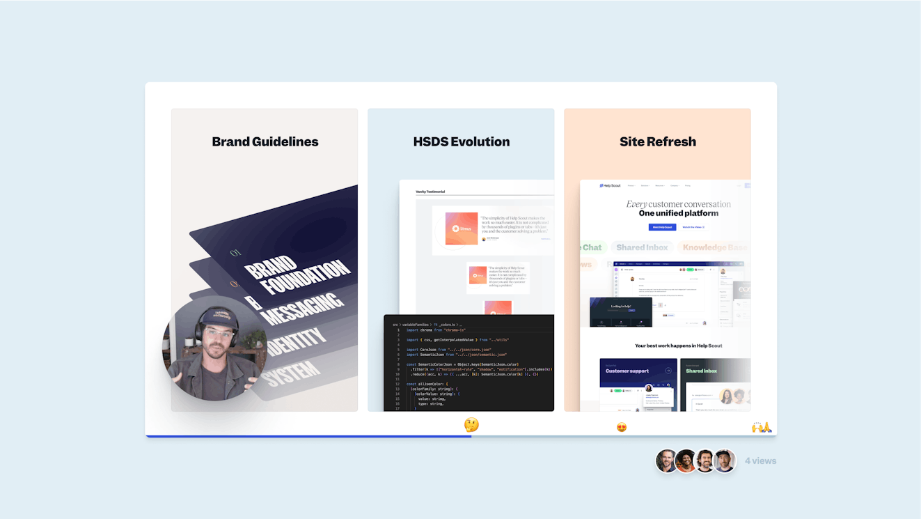
Equipped with a strong foundation, our creative director, Matt Plays, led the development of Help Scout’s new visual identity. For months, a five-person brand evolution crew that spanned brand and product design teams met regularly to discuss the extent of change we should usher in and how we’d set that change in motion. We wanted to create an identity that we wouldn’t outgrow too quickly, which meant we’d have to be comfortable growing into it a little — and we’d need enough tools to keep things fresh for a while. We debated fonts, shared hot takes, and had a lot of esoteric conversations about the meaning of good design.
Ultimately, we established the guidance around these elements of our visual identity:
Logo and wordmark
To maintain and perpetuate our brand equity, we opted for minor improvements. We recolored and rebuilt the mark — adjusting spacing and proportions to ensure it will scale from mobile to billboards. The visual weight of the mark and logotype are now equal in the wordmark and its font is now more timeless.
Typography
Bold typography brings our messaging to life and compounds the impact of our visuals. Our type stack now includes expressive headlines and specialized faces for display, blockquotes, and more. This adds emphasis to the copy, making it easier — and more important — to make a statement.
Color
Our new default color is Cobalt, a richer and bolder blue. We moved from a limited pastel palette to one that includes shades for colors across the spectrum. Although we’ve introduced a wider array of colors, our approach to using them has become more restrained. Most surfaces are a light, airy white or clay, allowing the other, bolder colors to draw attention and focus.
Graphic elements
We decided to completely abandon illustrations. It was a hard decision, but it was time. In their absence, we had to identify another way to create dynamic and engaging pages. We now leverage bold shapes, gradients, drop shadows, and linework that evoke a sense of simplicity and polish. We also lean into photography and collage which we hope will help people see themselves in the product. Fun fact: All of the smiling faces you see as avatars are real Help Scout employees!
Building a product-led brand
As a product-led company, product value is what makes us successful as a business. Our brand should be in support of the product, not in conflict. Over the years, the brand and product visuals grew apart, creating two very distinct experiences: The site was abstract and playful while the product was minimalist and direct. Our new identity creates true cohesion between the buying and product experiences. For the first time ever, our site visuals are primarily high-fidelity product visuals. The updated color palette and typography carry into the product, and we’ve built shared libraries for ongoing collaboration across the brand and product design teams.

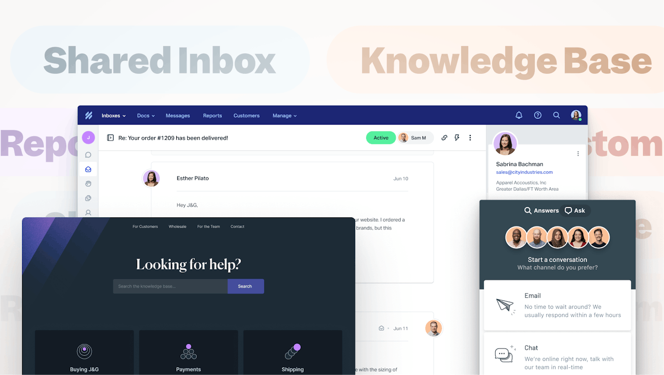
We’ve also adopted new storytelling principles to ensure that our website centers our product and makes it easy for people to see and understand what they’re getting with the Help Scout platform. We reduced the amount of copy on each page, amped up the visual storytelling, and brought in more data. Our goal with this approach is to help folks get to know us and to make the transition from buyer to customer more seamless.
The evolution continues
Our new brand is built for scale, but that doesn’t mean it won’t change again. We’re motivated to defy expectations and keep iterating. After all, the best brands are like great gardens — tended to carefully, pruned with intention, and, when necessary, leveled to begin anew.
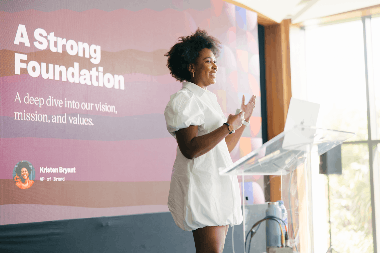
Kristen Bryant Smith
Kristen Bryant Smith is the VP of Marketing at Help Scout. She’s a lover of sports, movies, and wine and an advocate for equity and inclusion.